

Style guides
Set the colors, type and button styles of your tour steps once in a style guide, and choose which guide each tour uses.
A tour is often the first time a buyer sees your product, so its tooltips and cards should look like your company made them. A style guide holds that look: the colors, type, corners and buttons of every step. Set it once and every tour that uses it matches, instead of styling steps one at a time.
This article covers the Style Guides list, every section of the style guide editor, and how a tour picks its guide.
You're in the right place when your tour steps don't match your brand, or you want every tour in your workspace to share one look.
Where do you find style guides?
Go to Settings → Style Guides. You can also get there from the builder: open Settings in the top bar, and select Style guides at the top of the Appearance card. It opens in a new tab.
A style guide styles the parts ShowPilot draws over your screens: guide tooltips, lightbox cards and their buttons, plus the markers that draw the eye to an element. It doesn't change your captured screens, and it doesn't style chapter slides, which take their look from your brand kit. See Brand.
What's on the Style Guides list?
Each style guide is a card.
| Part | What it shows or does |
|---|---|
| Color swatches | The guide's main colors at a glance. |
| Name | The guide's name. |
| Default badge | Marks the guide new tours start with. It is the same setting as Theme in Settings → Tour Defaults, so changing either changes both. |
| Make default | On any other guide. Makes it the guide new tours start with, and moves the Default badge to it. |
| Age and font | How long ago the guide was created, and Used font. |
| Edit | Opens the guide in the editor. |
| Duplicate (copy icon) | Makes a copy named after the original with "(copy)" added with every setting, and adds it to the list. |
| Delete (bin icon) | Asks "Delete style guide?" and removes the guide when you confirm with Delete. This can't be undone. |
If you have no guides yet, the page offers New style guide in the middle. Until you make one, tours use ShowPilot Modern, the built-in look.
How do you create a style guide?
Start the guide
On Settings → Style Guides, select New style guide. Give it a Name, such as "Brand Default", and select Create. The editor opens.
To start from a guide you already have, select Duplicate on its card instead, then Edit the copy.
Work through the sections
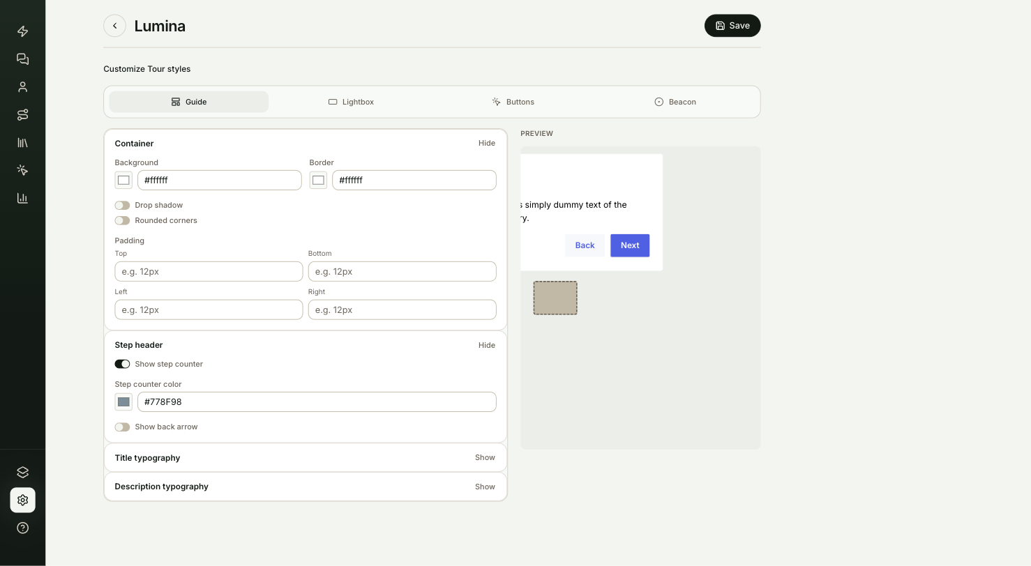
The editor has a section list across the top: Guide, Lightbox, Buttons and Beacon. The form is on the left and a live preview on the right. Each section is described below.
Check the preview
The preview updates as you type. It shows a sample tooltip with a title, a description and two buttons. While you're on Lightbox, it shows a sample lightbox card instead.
Save
Select Save at the top right. It reads Saving…, then Saved. The editor doesn't save on its own, so save before you leave the page, or your changes are lost.
You can rename the guide at any time by editing the name at the top of the editor, then saving.
What can you set in each section?
Sizes are typed as text, so you can use any unit the browser understands, such as 12px. Colors use a color picker with a hex value you can type.
The box of a guide tooltip.
| Setting | What it does |
|---|---|
| Background | The tooltip's fill color. |
| Border | The color of the thin line around the tooltip. |
| Drop shadow | On adds a soft shadow under the tooltip. Off leaves it flat. |
| Rounded corners | On gives the tooltip rounded corners. Off makes them nearly square. |
| Padding | Space inside the tooltip, set separately for Top, Bottom, Left and Right. Empty sides use the built-in spacing. |
The line above the title that tells the viewer where they are.
| Setting | What it does |
|---|---|
| Show step counter | Shows or hides the step counter, such as "Step 1 of 3". |
| Step counter color | The counter's text color. It appears while the counter is on. |
| Show back arrow | Shows a small back control at the top of each tooltip that takes the viewer to the previous step. It never appears on the first step. |
| Back arrow color | The back control's color. It appears while the control is on. The tooltip's pointer has no setting: it always matches the tooltip color. |
Two groups with the same settings: one for the tooltip's title and one for its description. Both start collapsed; select the group to open it.
| Setting | What it does |
|---|---|
| Color | The text color. |
| Font family | The font, typed by name. Empty uses the tour's font. |
| Font size | The text size, such as 14px. |
| Style | Bold, Italic and Underline buttons. Select one to turn it on. |
| Letter spacing | Extra space between letters, in pixels. 0 is normal spacing. |
| Line height | The height of each line. A plain number is read as pixels. |
| Bold weight | How heavy the text is when Bold is on, such as 600 or 900. |
The centered cards used for introductions and closing asks. Lightbox has the same groups as Guide, applied to lightbox cards:
- Container: Background, Border, Drop shadow, Rounded corners and Padding.
- Step header: Show step counter and Step counter color. Lightboxes have no back arrow setting.
- Title typography and Description typography, with the same settings as the guide.
Style a lightbox separately from the guide when you want the intro and closing cards to feel bigger or quieter than the tooltips.
Two groups, Primary button and Secondary button, each with the same settings. The primary button is the main action on a step, such as Next. The secondary button is the other one on a two-button step, such as Back. Both guides and lightboxes use these buttons.
| Setting | What it does |
|---|---|
| Shape | square, rounded or pill. |
| Font family | The button's font, typed by name. |
| Size | The button's text size. |
| Custom width | A fixed width, such as 120px. |
| Custom height | A fixed height, such as 36px. |
| Background | The button's fill color. |
| Background hover | The fill color when the viewer points at the button. |
| Text color | The label color. |
| Text hover | The label color when the viewer points at the button. |
Beacon sets the colors of the two markers a step can put on an element. The Beacon group colors the pulsing dot, and Glow colors the light around the element. Whether a step shows either one is set on the step itself. See Step settings.
Each group has one Color.
Do all the settings show in tours?
Yes. Every setting on this page reaches the tour player on the tour's next publish. Size, Custom width and Custom height take a number, read as pixels, or a length with its unit, such as 2.5rem; anything else is ignored.
How does a tour pick its style guide?
Each tour has one style guide, chosen in two places.
| Where | What it decides |
|---|---|
| Settings → Tour Defaults → Theme | The guide every new tour starts with. Changing it doesn't change tours you've already made. See Tour settings and defaults. |
| Style guide in the builder's Settings panel | The guide this one tour uses. It overrides Tour Defaults. ShowPilot Modern (default) is the built-in look. |
A tour you make with Copy a tour keeps the style guide of the tour it was copied from.
Your brand kit's colors and logo apply no matter which style guide a tour uses.
When does a style guide change reach viewers?
The guide's styles are frozen into a tour when it's published. After you save a change to a guide, publish each tour that uses it again, with Update in the builder, to show the change to viewers. Until then, viewers keep the look from the last publish. See Publish a tour and manage revisions.
The builder's Preview shows the current guide straight away, so you can check a change before you publish.
How do you apply a style guide to a tour?
- Open the tour in the builder and select Settings in the top bar.
- On the Appearance card, choose the guide under Style guide.
- Select Update at the bottom of the panel to save.
- Select Publish or Update in the top bar to show it to viewers.
Test it
Your style guide is working when:
- You change the Background in the Guide section, and the preview tooltip changes color.
- You select Save, and the button reads Saved.
- You pick the guide under Style guide in a tour's Settings panel, select Update, and Preview shows the new color.
- You publish the tour, open its share link in a private window, and the tooltips show the new color.
Troubleshooting
| Issue | What to check |
|---|---|
| Viewers still see the old look | Styles are frozen at publish. Select Update in the builder's top bar for each tour that uses the guide. |
| Changes disappeared after leaving the editor | The editor doesn't autosave. Make the change again and select Save before you leave. |
| A new tour doesn't use your guide | New tours start with Theme in Settings → Tour Defaults. A copied tour keeps its source's guide. |
FAQ
What happens to tours when I delete a style guide they use?
Published tours keep their look, because it was frozen when they were published. The next time you publish one of them, it falls back to ShowPilot Modern. Choose another guide in the tour's Settings panel before you publish.
Can I style one step differently from the rest?
Not with a style guide. A guide applies to every step in the tour. A step's own settings cover its position, width and markers. See Step settings.
Do my brand colors apply to every style guide?
Yes. Your brand kit's colors and logo apply no matter which style guide you pick. See Brand.
How do I make a guide the one new tours use?
Set it as Theme in Settings → Tour Defaults. New tours start with it from then on.
Can I use my own web font?
Type the font's name in Font family. The tour shows it only when the viewer's browser already has that font, such as a common system font. Otherwise the text falls back to a standard font.
Related articles
AI tools in the builder
Change what's on captured screens with AI Edit on one element, Ask AI across a screen or the whole tour, and Find & replace for exact text swaps.
Tour settings and defaults
Set the house style every new tour starts from in Tour Defaults, and change one tour's name, look, voiceover, delivery and serving in the builder.